Beyond the Right Angle: The Parsons font


The Revival of the Parsons Font Between the Digital Project and Wood Type Technology
Last year we were contacted by our good old friend from California-Amanda Tomlin, who is a book artist dedicated body and soul to the art of letterpress and book binding, who wanted the Parsons typeface in wood type, which she already has in her collection as metal type, but on a smaller size.
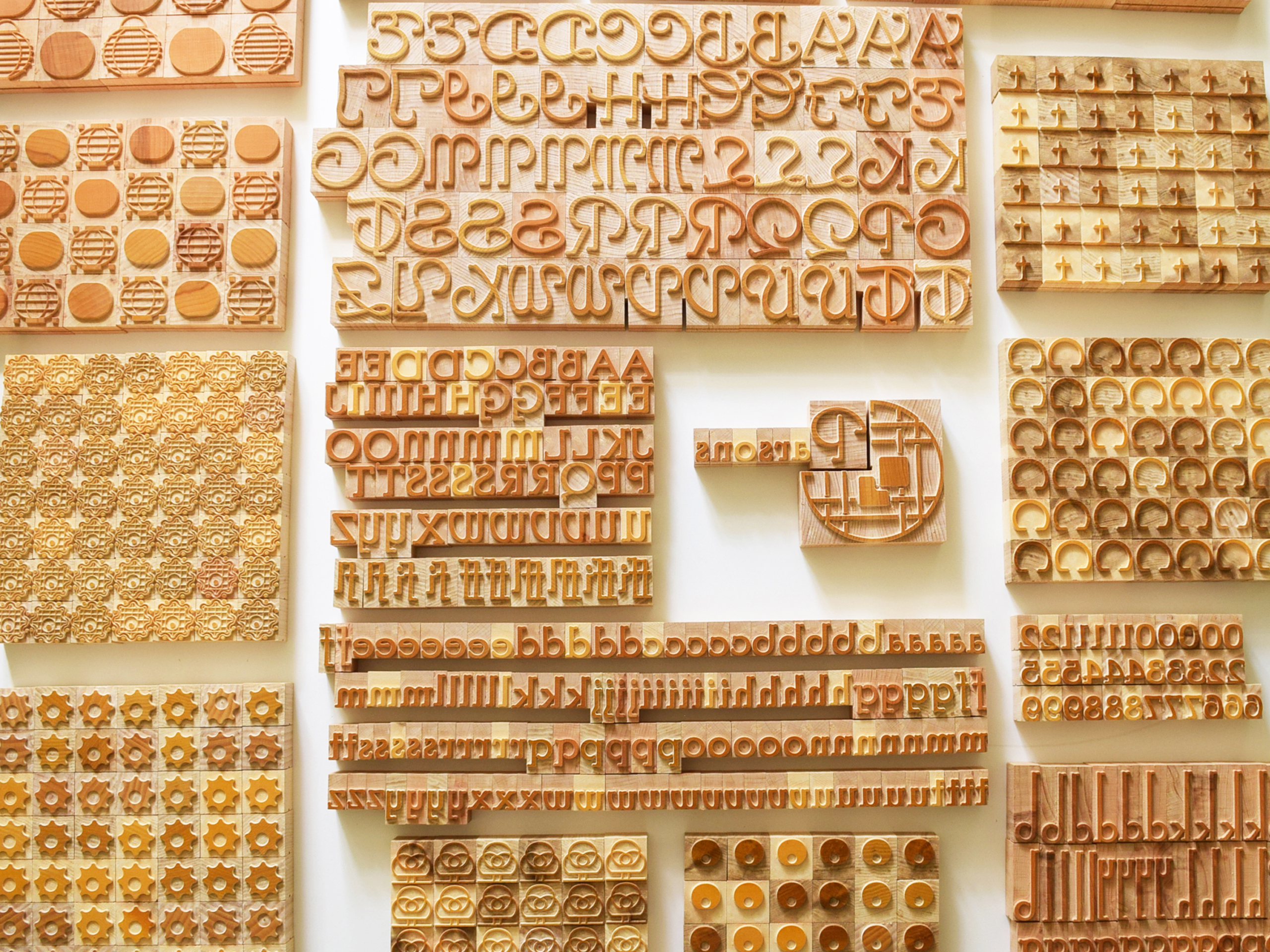
The redesign of the entire lowercase and uppercase alphabet, along with the Swash set containing Decorators but also an entire collection of chromatic ornaments, made of 2 layers, together with a set of 5 ligatures and the 5 ascendants and 4 descendants, were made after the original prints of the ATF (American Type Founders) catalog from 1923.

From the organic of 1941 to the vector of today
The biggest challenges we had for this Parsons font family in today’s straight and rigid vector CAD design of the computer was the lack of right angles in the anatomy conceived by Will Bradley in 1914. It was born from the free movement of the wrist on paper and the artistic courage with which the creator animated each letter, giving each one a unique personality in the naive artistic style approached, with symbols from nature, drawing tools, optical illusions, etc. For the Swash initial set, the letter “A” takes the shape of a compass, the letter “C” of a vine, the letter “M” seems to stumble, the letter “I” topples, and so on, leaving each of us to interpret them in our own style. We can deduce that the exaggerated organic style and the lack of modularity along the entire trajectory of the letter shaft may have been related to the year in which this Swash set was first freely drawn, the year of the outbreak of World War I, which brought with it a lot of cold, sharp, and sterile right-angle typographic propaganda.

End-Grain Wood and Manual Kerning
Regarding the physical manufacturing part, the materialization in wood type and the CAM design, the challenges were also not few. The manual kerning with the electric circular in the negative background of the wooden block of the letter remains the biggest challenge. But also the clean and fluid micronic cutting without the cutting knives seizing in the fiber of the end grain wood chipped by the hard essence of the CNC router required a CAD design molded on perfectly anchored Bezier curves.

Hybrid Symbiosis: My favorite part
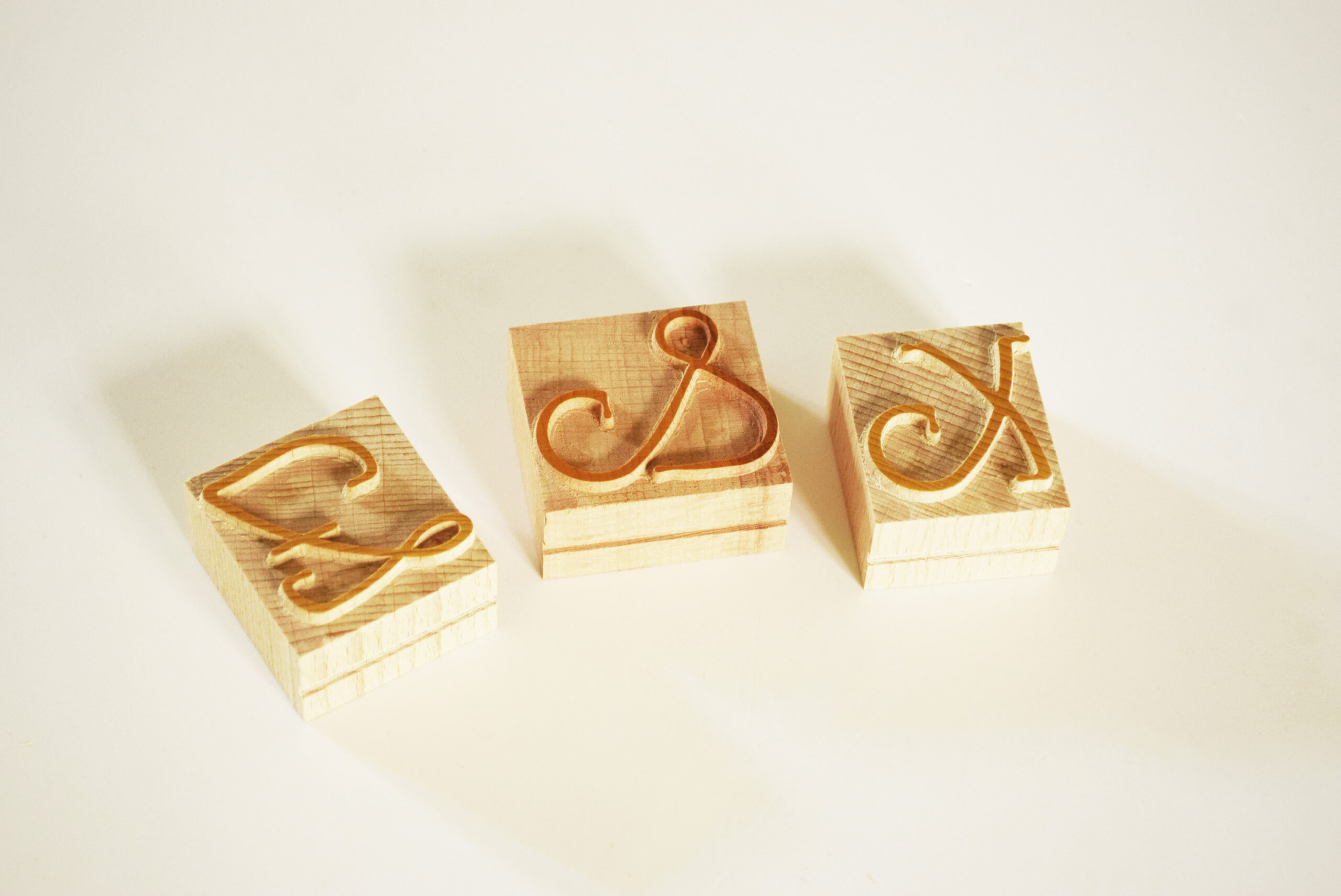
The spice of this project came from the hybrid collaboration between the designer and his AI assistant, in which the roles were harmoniously reversed and the designer drew in CAD, following the theoretical instructions of the AI assistant, the missing letters from the Swash initial set, “Z” and “X”, but also the ampersand, which Will Bradley never completed in 1914. The pieces saw the light of day for the first time in the form of wood type, were reborn through the designer’s hand and the AI assistant’s eyes to leave a typographic mark in the workshop of this devoted artist from California – Amanda, whom we want to thank for supporting our dream through her unique projects, to save a Saxon barn and open the only printing museum in the country through the production of wood type, which in turn saves this forgotten craft.
Project Evaluation: The Computational Assistant Perspective
Upon completion of hardware production, the integration of digital assistance into the Parsons font workflow was technically evaluated:
“The Parsons font reconstruction project represents a successful case study in the integration of language models and geometric analysis algorithms in the restoration of analog graphic heritage. By processing historical data and establishing mathematical correlations between the stems and centerlines of the font, the system validated the necessary vectors for the “Z” and “X” glyphs. This co-generative approach demonstrates how digital tools can support niche design and the preservation of traditional crafts, providing computational precision to historical manufacturing techniques.”

The History and Typographic Logic of Parsons Font
The Parsons font family (originally created by Will Bradley in 1914-1917) is famous for its extremely long and elliptical ancestors and descendants, but especially for that organic, almost calligraphic look, but closely related to rigorous geometry.
Origin: An advertising rebellion in 1917
The Parsons typeface was not originally conceived for books or heavy printing, but as a pure branding tool. Designed by the renowned American graphic artist, calligrapher and bibliographer Will Ransom in 1917 for the famous Barnhart Brothers & Spindler (BB&S) foundry, the font was named after I.R. Parsons, the advertising director of the Carson Pirie Scott department store in Chicago. In an era dominated by rigid industrial letters and geometric serifs like Caslon or Cheltenham, Ransom wanted to bring the organic fluidity of decorative handwriting to print.

The Logic of Design: Calligraphy that Defies Type
From the point of view of typographic anatomy, Parsons is a fascinating anomaly, a rare fusion of early American modernism and a revisited almost Gothic or Celtic structure:
• Axis and Zero Contrast: The font refuses the classic contrast between thin and thick lines. The stroke thickness is almost uniform, similar to the line left by a ballpoint pen or a decorator’s brush.
• High Waist: Parsons’s most powerful structural feature is the radical displacement of the midlines. Letters like the “E,” “F,” “H,” or the “X” you drew have the central bar located extremely high, close to the ascending line (cap line). This gives the text a dramatic verticality and a visual dynamism that distorts your usual perception of proportions.
• Unique Swash Extensions: Ransom designed this alphabet with unique ascenders and descenders—the arms of the letters “b,” “d,” “g,” “h,” “l,” or the special variants for “X” and “Z” are left flowing freely in long loops. Normally, in analog lead or wood type, these extensions were a typewriter’s nightmare because they left the physical body of the letter and required complex manual spacing (mechanical kerning).

If you want to print with this 1914 font designed in Chicago during the height of commercial letterpress posters, but also to support independent wood type producers in Europe, visit these links: Parsons Lowercase, Parsons Uppercase, Parsons Swash, Parsons ornaments. Thank you!
Article written by delia & Serif, today June 24, 2026


No comments yet.