
👉 The Story of Scala Manicule: A Unique Wood Type Project with Martin Majoor


👉 Description
The symbol “Manicule” is a typographic mark – the etymology of the word comes from the Latin language: “manicula”, which means “small hand” or fist. It is also called: printer’s fist, bishop’s fist, digit, mutton-fist, hand, hand director, pointer and pointing hand.
👉 History
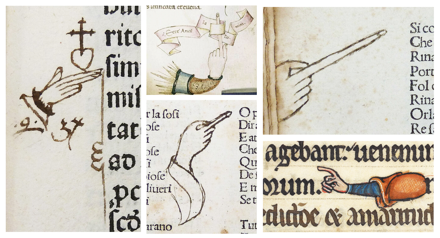
The Manicule symbol has been found in manuscripts, around Europe since the Medieval and the Renaissance period. The first Manicule that ever appeared in a handwritten manuscript, is dated to the 12th century (by the method of radiocarbon dating by AMS) The Manicule symbol became popular only in the following centuries.
👉 Use
The Manicule symbol, in the old manuscripts, appears on the edge of the page to mark corrections and annotations, accompanied by an important explanatory notes, in the form of a passage, column, title, drawing etc, adjacent to the text to which the author refers. It is synonymous with: “Attention” or “Note”. At it’s sight you think of the “Exclamation Mark”-“!” or “Interrobang Sign”-“‽”.
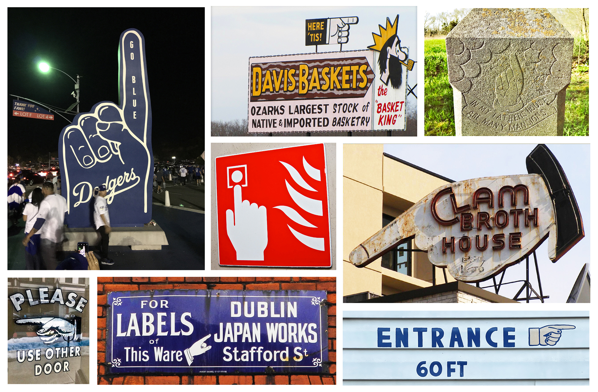
👉 In modern times the Manicule symbol is popular in advertising, publications and signage. The symbol it is often replaced by the graphic symbol – Arrow – a form much easier to understand for most people, to show direction, either is replaced by symbols such as: “Bullet – like”, “Asterisks”, “Fleuron” and so on. The Manicule is usefull in typographic design through the ability to transmit in the most shortly the viewer’s message.
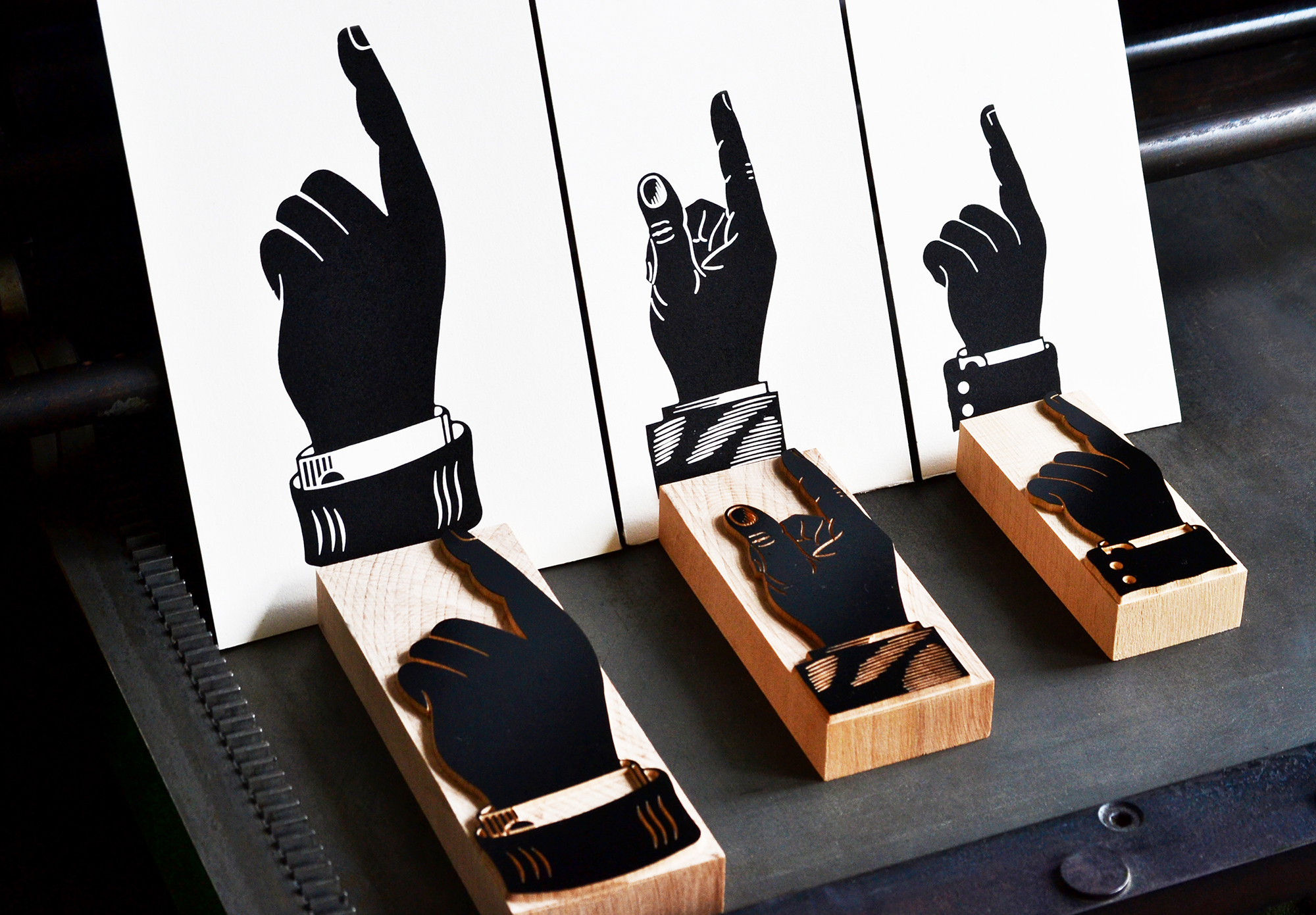
👉 The Manicule and Letterpress Art
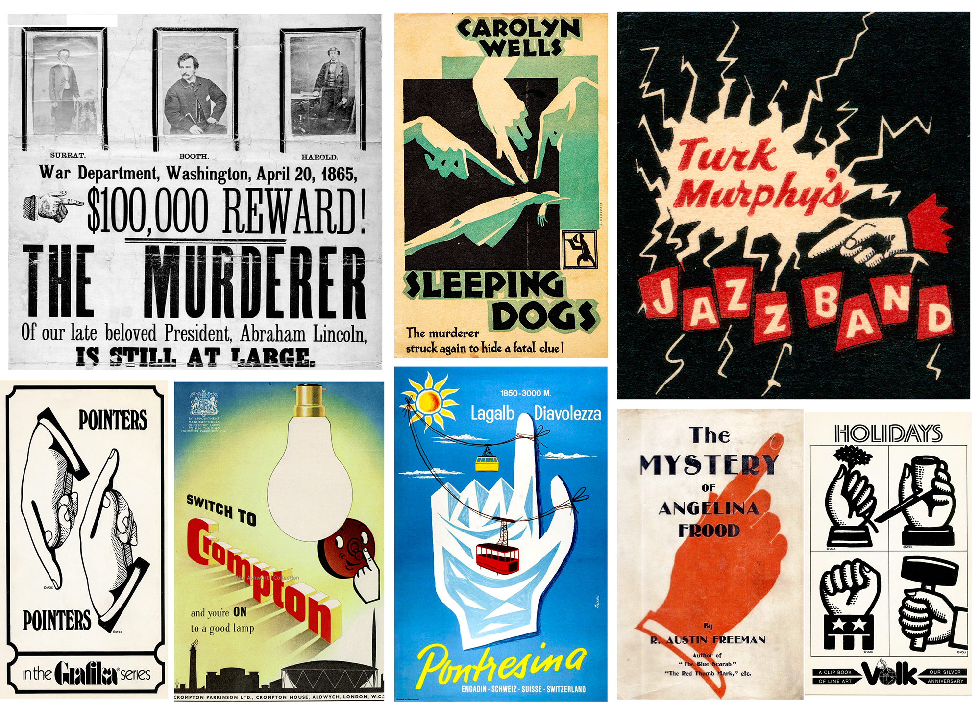
The Manicule symbol in Letterpress Art is like a nostalgic landmark for letterpress practitioners, by virtue of resonates with the golden period of letterpress printing (a period from which many publications, books, posters etc, that contain the Manicule symbol are still preserved).
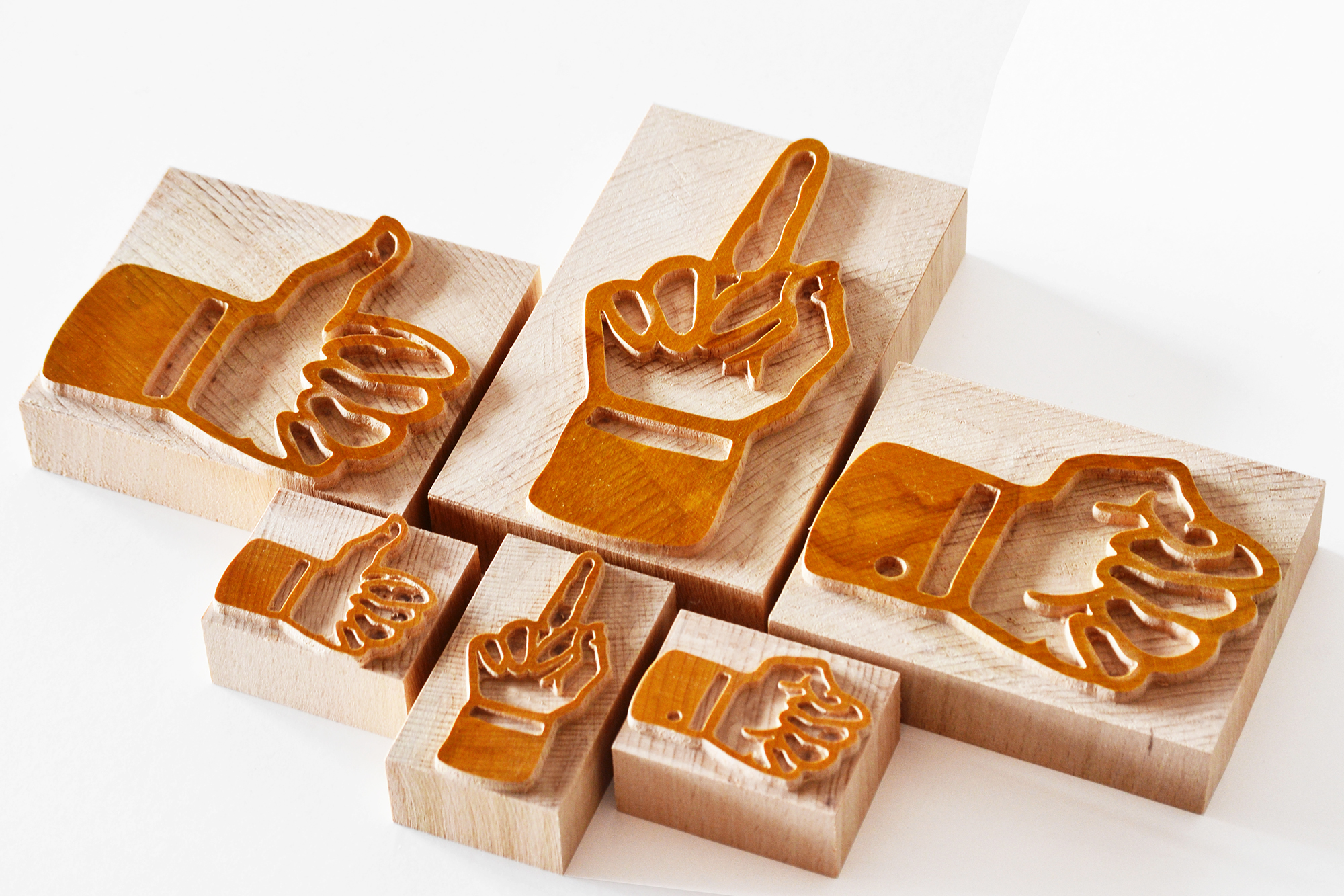
👉 The Scala Manicule Project
The Scala Manicule Wood Type project is innitiated by Petrescu Press through a collaboration with designer Martin Majoor. The Scala Manicule project aims to produce a series of Manicules in wood type, based on the design created and supplied by Martin Majoor.
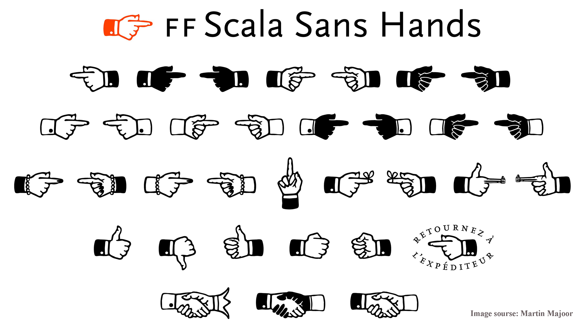
👉 Scala Typeface is designed by Martin Majoor, and was launched on 17 November 1989, at Music Center Vredenburg in Utrecht. In 1991 it was released as FF Scala – “FontShops first serious text typeface, with a sans, and it has become one of FontShops bestselling fonts”. Scala Hands are part of the Scala Family Typeface.
👉 The original seriffed hand has been designed by Bruce Rogers in 1933 and used in the book ‘Æsop’s Fables’, with a “sans serif” version of this Manicule.
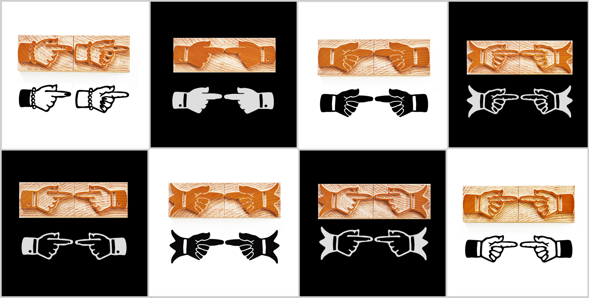
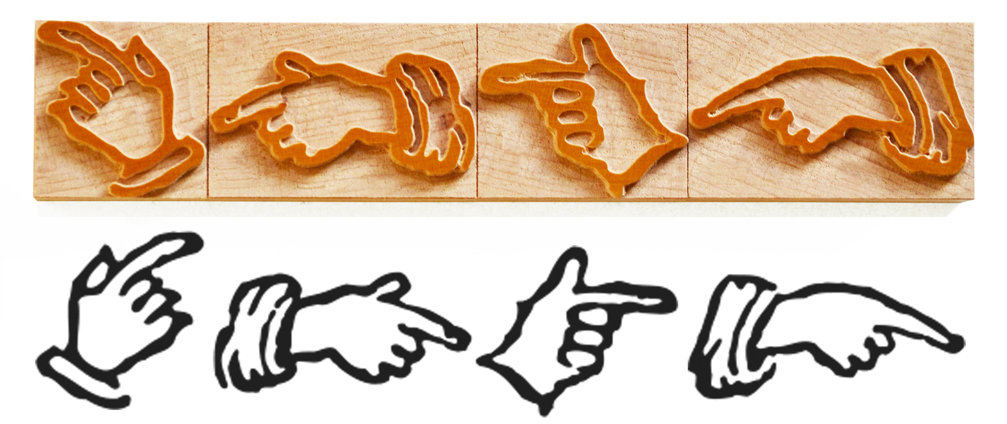
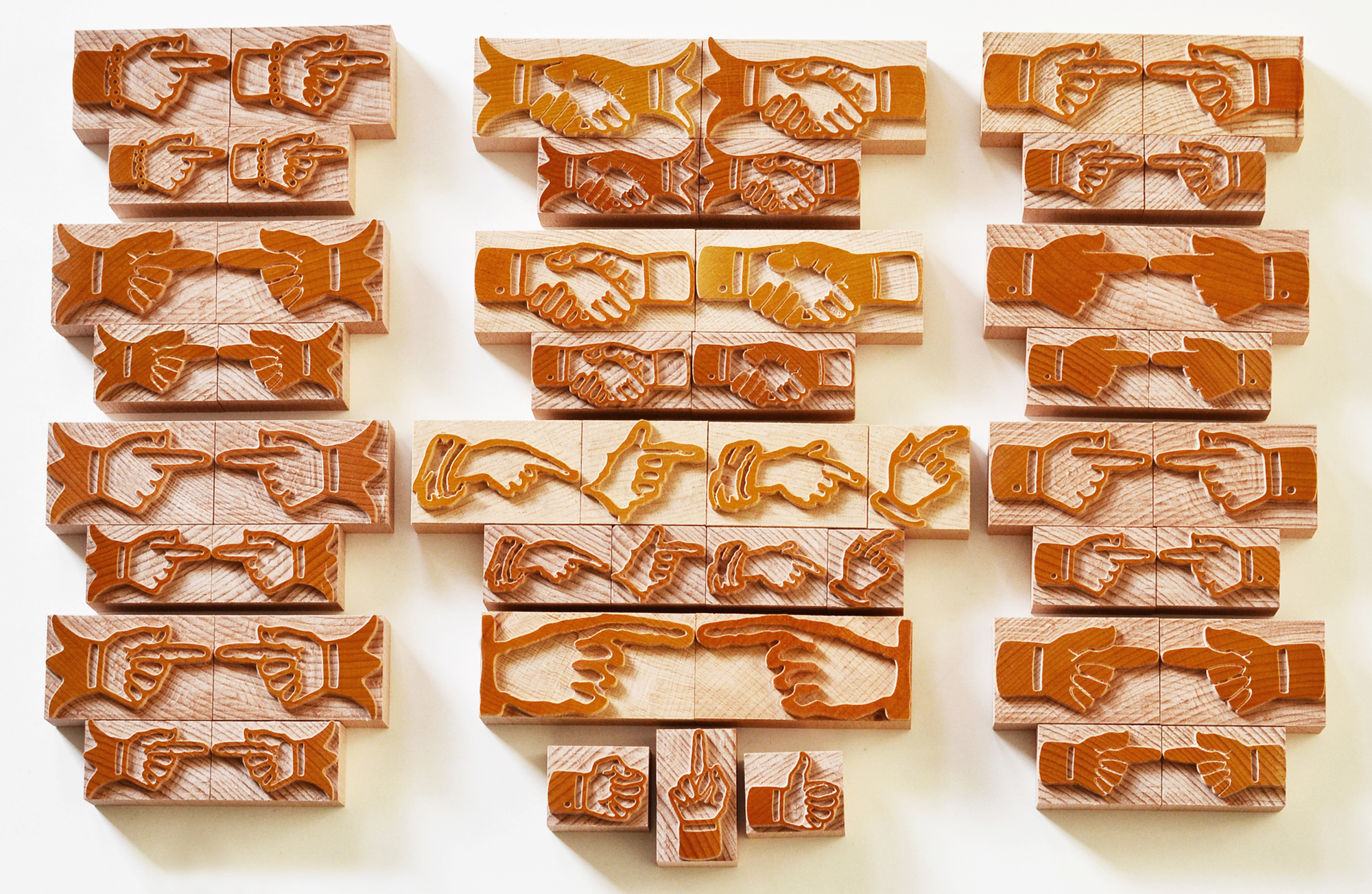
The Scala Manicules Wood Type are divided into the two categories “Sans” and “Serif”:
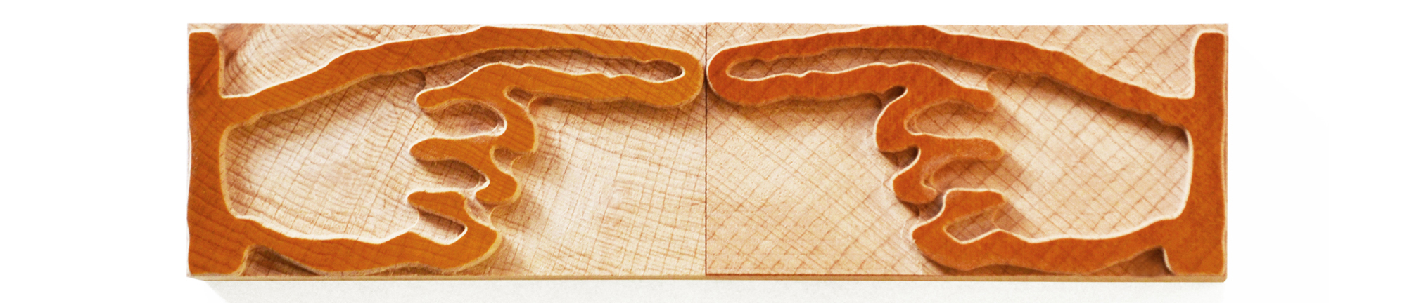
1. “Serif” Hands (Harlequin Cuffs)
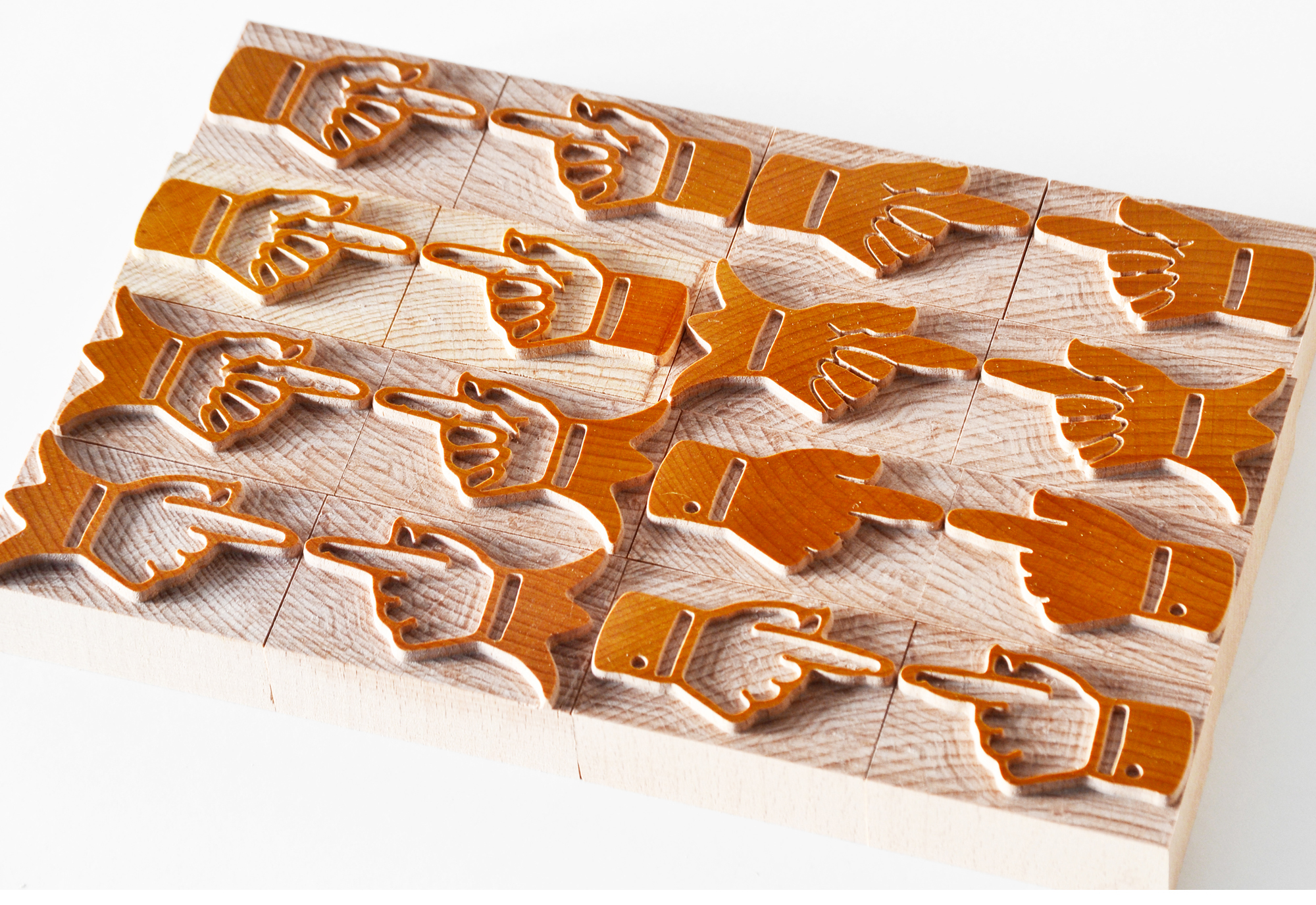
👉 Pointers (right and left) with black Harlequin Cuffs.
👉 Pointers (right and left) with white Harlequin Cuffs.
👉 Diffrent hand gesture.
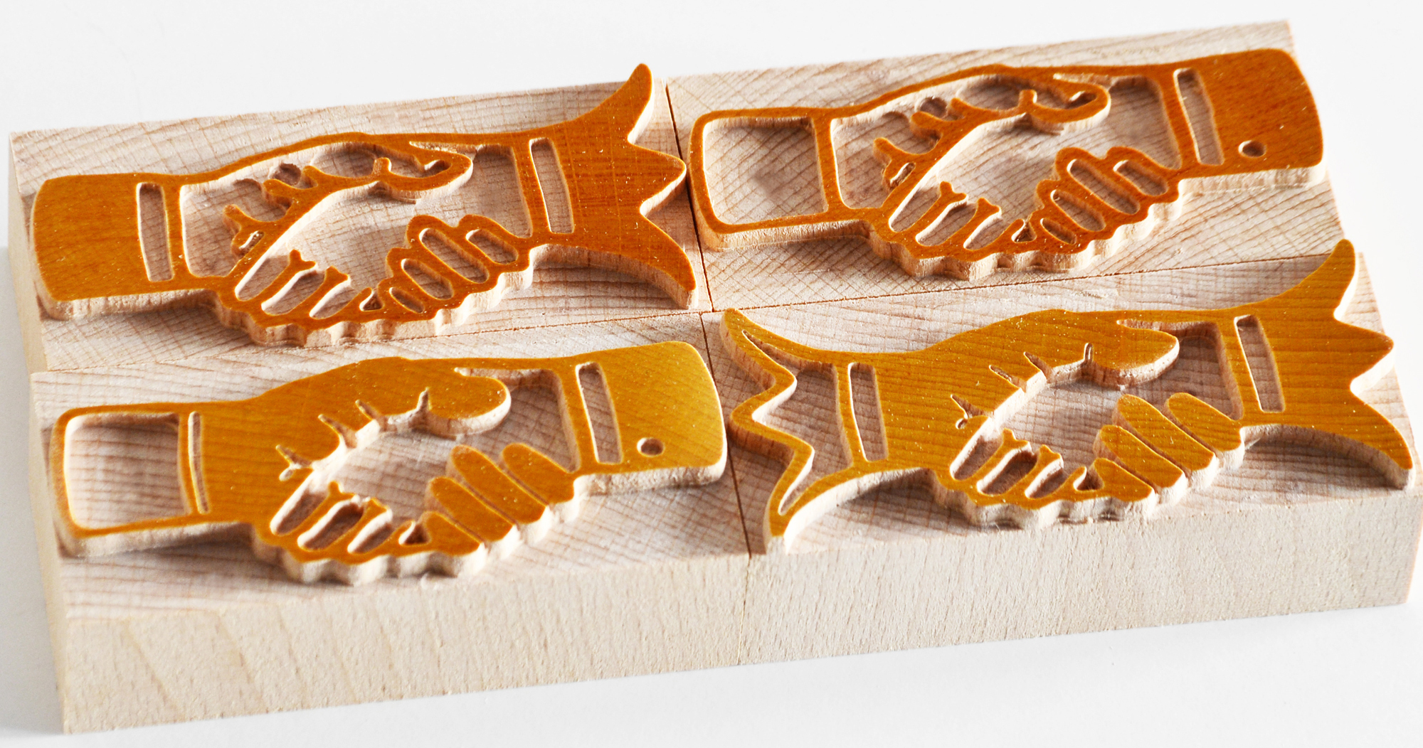
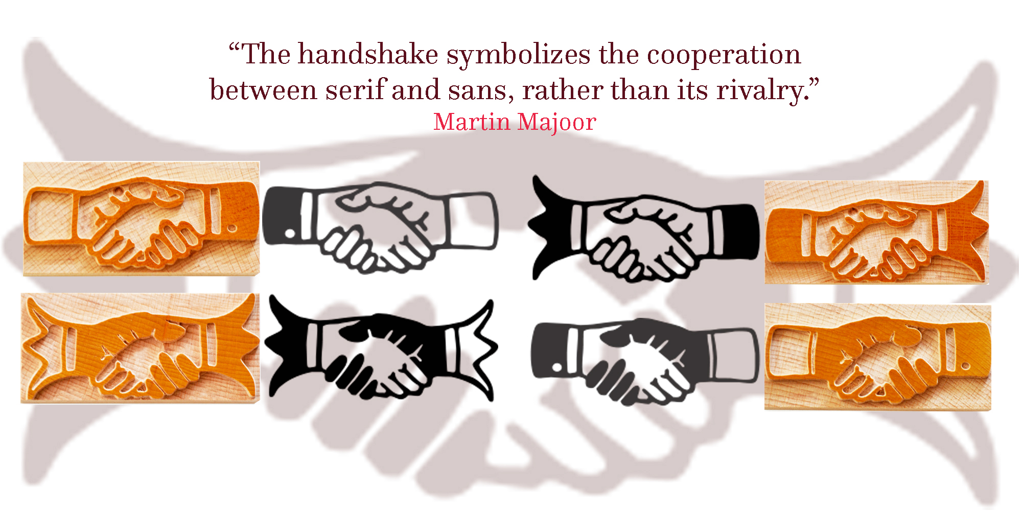
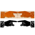
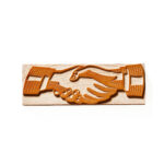
👉 Handshakes.
2. “Sans” Hands (Straight Cuffs)
👉 Pointers (right and left) with black Straight Cuffs.
👉 Pointers (right and left) with white Straight Cuffs.
👉 Diffrent hand gesture.
👉 Handshakes.
👉 The Oldest Manicule
When I contacted Martin Majoor and talked about the Manicule Scala Project, he briliantly sugested to revive into wood type, the oldest Manicule, which was ever printed.
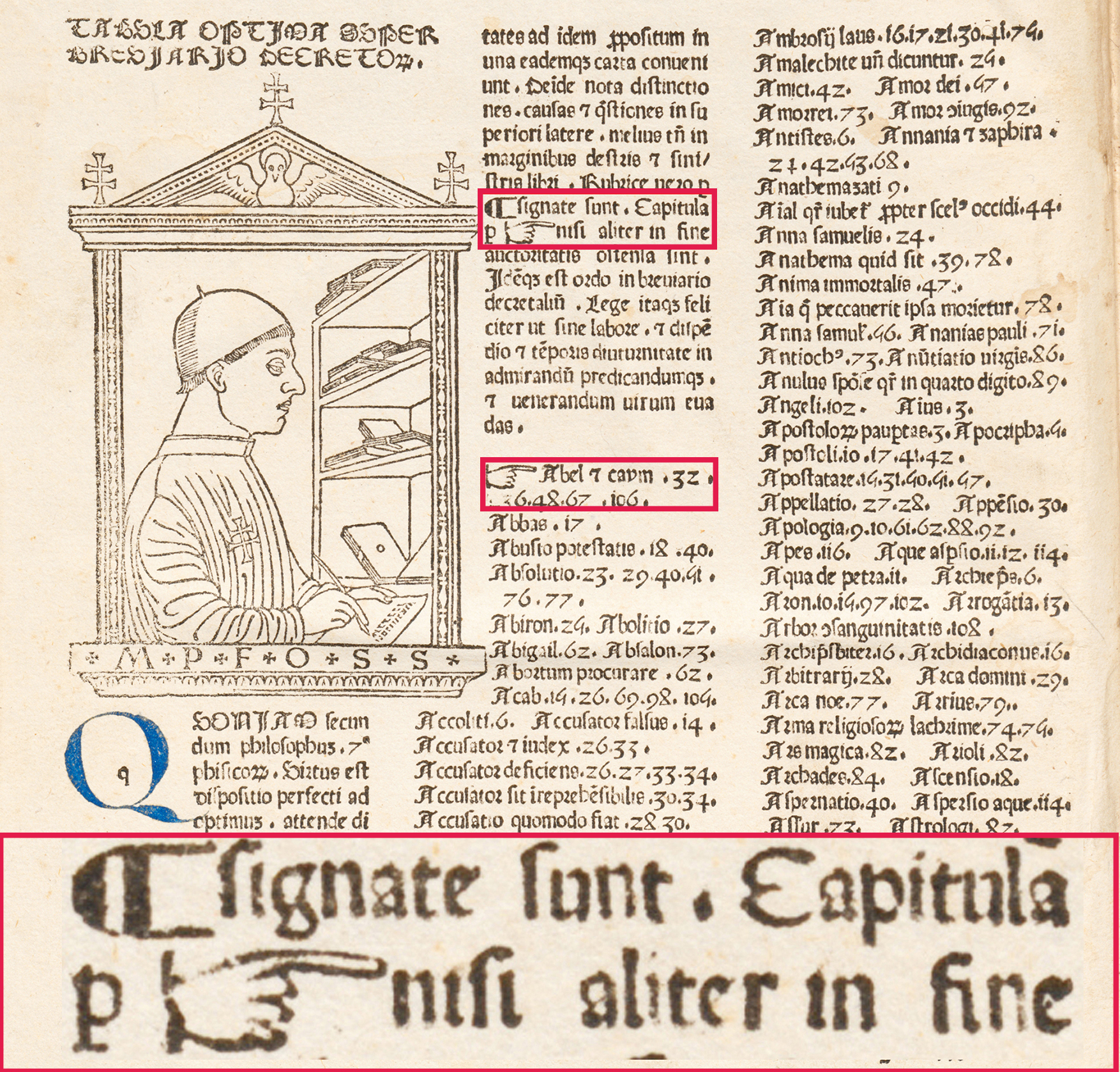
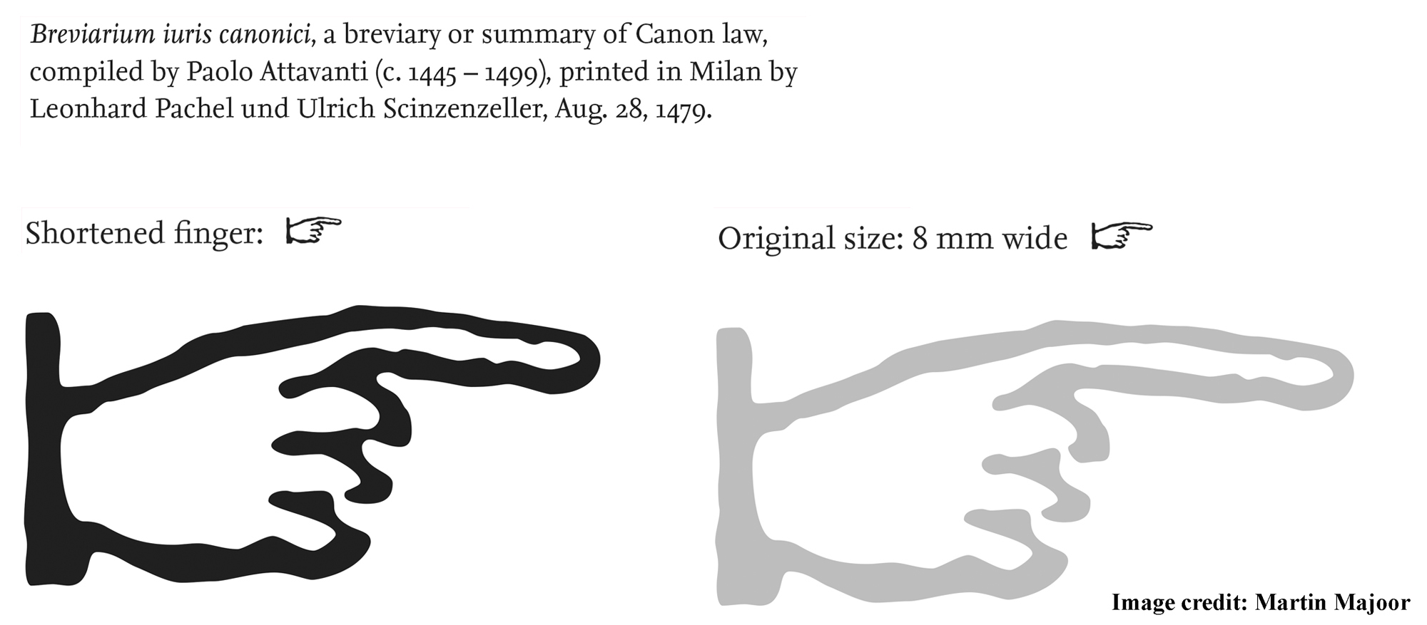
👉 John Boardley from “I Love Typography”, provided helpful information to Martin, about the research and history of the oldest printed Manicule. Namely, the Metal Type Manicule printed in “Breviarium Juris Canonici” – a breviary or summary of Canon law, compiled by Paolo Attavanti (c. 1445 – 1499), printed in Milan by Leonhard Pachel and Ulrich Scinzenzeller, in Aug. 28, 1479.
👉 The original Metal Type Manicule size, was 8 mm wide, with the index finger peculiarly too long, so Martin suggested to shorten it, which improved it’s aspect at the larger size.
👉 Alongside this set of Manicules, we made a series of Classic Garamond Wood Type Manicule, which were sent to the printer Thomas Gravemaker in the center of Amsterdam – to print with them beautiful letterpress art works.
👉 I take this opportunity, to tell you about, how I met Martin Majoor. In Bucharest at a meeting about typography, organized by Graphomat, in the contest “The Most Beautiful Books”, year 2019.
Where I asked him:
“If your letters were a musical instrument, what would it be?”
To which Martin replied:
“A violin.”
This testimony, guides me to his exquisite font – Questa Grande.
👉 The second aspect I noticed in Martin’s work, is the attention he pays to the letter’s dual quality: “sans” and “serif”- a Type Design Philosophy that leads to dichotomy, polarity, sharp-rounded, bitter-sweet, black and white – freedom.
👉 About Martin Majoor – he is a Dutch type designer, with extensive experience in typography and book design. He received the award for Best Dutch Book Design in 1995, for the book “Adieu Esthetica and Mooie Pagina’s!”. Martin Majoor received in 2001 the International Printing Prize, in London for the Font Family Seria.
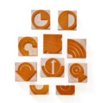
👉 Furthermore Petrescu Press offers letterpress practitioners a wide collection of Manicules Wood Type, which include the oldest, most interesting and unique Manicule – starting with classical Manicule and up to Modern and Chromatic Manicule.
👉 List of References:
👉 Books:
1. William H. Sherman “Toward a History of the Manicule”, March 2005
👉 Source of photos:
👉 Signage and Billboard Advertising:
1. Headstone, Howell Cemetery, MO – Darren Snow, Manicule Group;
2. Billboard advertising sign, Hoboken NJ – Debra Jane, Manicule Group;
3. Billboard advertising sign, The Basket King, MI – Jim Saw That, Manicule Group;
4. Street label, Dublin – Public Domain;
5. Fire signage, London – Robby Virus, Manicule Group;
6. Door signage – Sean, Manicule Group;
7. Entrance signage – Stephen Coles, Manicule Group;
8. Totem Dodgers, LA – Nick Sherman, Manicule Group;
👉 Publications, Posters, Books:
1. Pointers, Grafika, Print, No. G77 Volk Inc, 1977 – Bart Solenthaler, Manicule Group;
2. Sleeping Dogs, Book, Carolyn Wells, NY, 1929 – Ivan Chekhov, Manicule Group;
3. Earthquake McGoon’s, 99 Broadway, San Francisco – Stephen Coles, Manicule Group;
4. John Wilkes Booth Wanted Poster – Public Domain;
5. Pontresina Poster, Engadin Schweiz, Switzerland, 1960 – Public Domain;
6. The Mystery of Angelina F, AL Burt Co. NY, 1925 – R. A. Freeman, Manicule Group;
7. Switch to Crompton Advert, Crompton Parkinson Ltd, 1951 – Public Domain;
👉 Old Manuscripts: year ~ 1100, 1200, 1481, 1600 – Public Domain;
1. “Breviarium Juris Canonici”, Paolo Attavanti (c. 1445 – 1499), printed in Milan by Leonhard Pachel and Ulrich Scinzenzeller, in Aug. 28, 1479.
Excellent piece of background information here!
Thank you Thomas!
Bun articol, multumim!
Multumim Matei! Si portofoliul tau arata destul de bine!