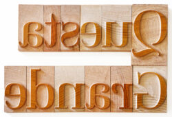
Questa Grande Project – Martin Majoor


This summer Petrescu Press was contacted by Mr. Thomas Gravemaker who leads Letterpress Amsterdam for a wood type project. It involved the bringing together of typeface designers, the wood type maker and letterpress printer for a first time in modern times. The font is Questa Grande, from the Questa typeface superfamily, these are some of the font’s features, in the words of the authors:
“The Questa Project is a type design adventure by Dutch type designers Martin Majoor and Jos Buivenga. Their collaboration began in 2010 using Buivenga’s initial sketches for a squarish Didot – like display typeface as a starting point. It was a perfect base on which to apply Majoor’s type design philosophy that a serif typeface is a logical starting point for creating a sans serif version and not the other way around. The extensive Questa family includes serif, sans, slab and display typefaces.”
About Martin Majoor – is a Dutch type designer, with extensive experience in typography and book design. He received in 1995 the award for Best Dutch Book Design, for the book “Adieu Esthetica and Mooie Pagina’s!”. Martin Majoor in 2001 received the International Printing Prize in London for the Font Family Series.
Image courtesy of The Questa Project

About The Questa Project – “Typefaces like Didot, Bodoni, and Walbaum were reviewed and some characteristics were used as rough guidelines for the design. To prevent Questa’s shapes from becoming too clean and sharp, several features – not typical to Didot – like typefaces – were considered. The goal was not to make a revival of any of these three, but rather an original typeface.”
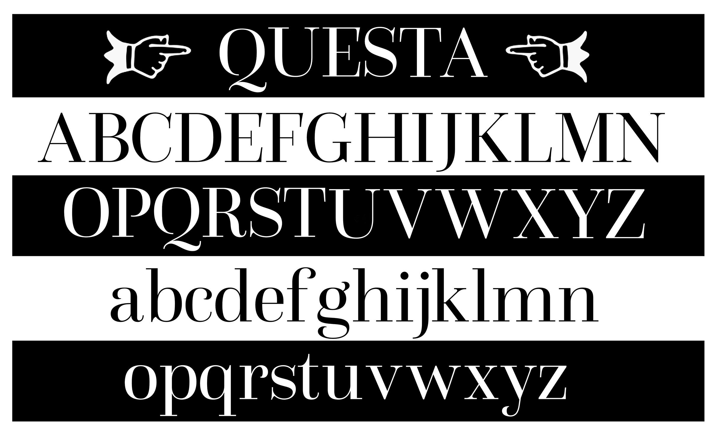
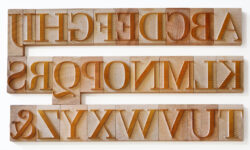
Image courtesy to Letterpress Amsterdam
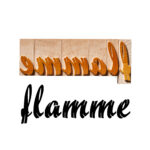
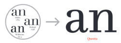
The Grande version is the typical display typeface, directly based on the text version of Questa.
In the text version of Questa the thickness of the serifs and the thin parts are incremental. This means the thin parts in Questa Light are thinner than the ones in Questa Black. In all five weights of Questa Grande however the thin parts share exactly the same thickness of stroke.”
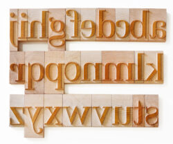
image courtesy to Letterpress Amsterdam
“It is interesting to conclude that of all Questa versions, Questa Grande comes closest to the spirit of the best work of Giambattista Bodoni and Firmin Didot, without attempting to copy it.”
You can find an author’s complete description, for this typeface, at The Questa Project.
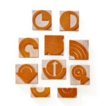
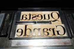
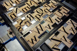
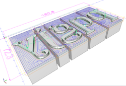
From a wood type production point of view, this design came with it’s own challenges: the main issues being the uniform width “thin hairline serifs”. Even at a 12 cicero size, the serifs and consistent parts of character anatomy, would barely measure 1mm (or 0,039″) in width, for long stretches of the type body. Such thin long segments would not make for a reliable set of type, if made using the standard machining tehnique we currently employed. So we adopted the method of manual cutting, individually, with chisels, to highlight the excessively sharp corners.
In order to accommodate these features, we decided to try and employ a technique we noticed in historical wood type, called a “talud”.
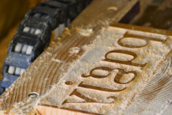
This involves milling with a beveled edge, giving thin lines a thicker base, thus more support, considerably increasing the resilience of this type.
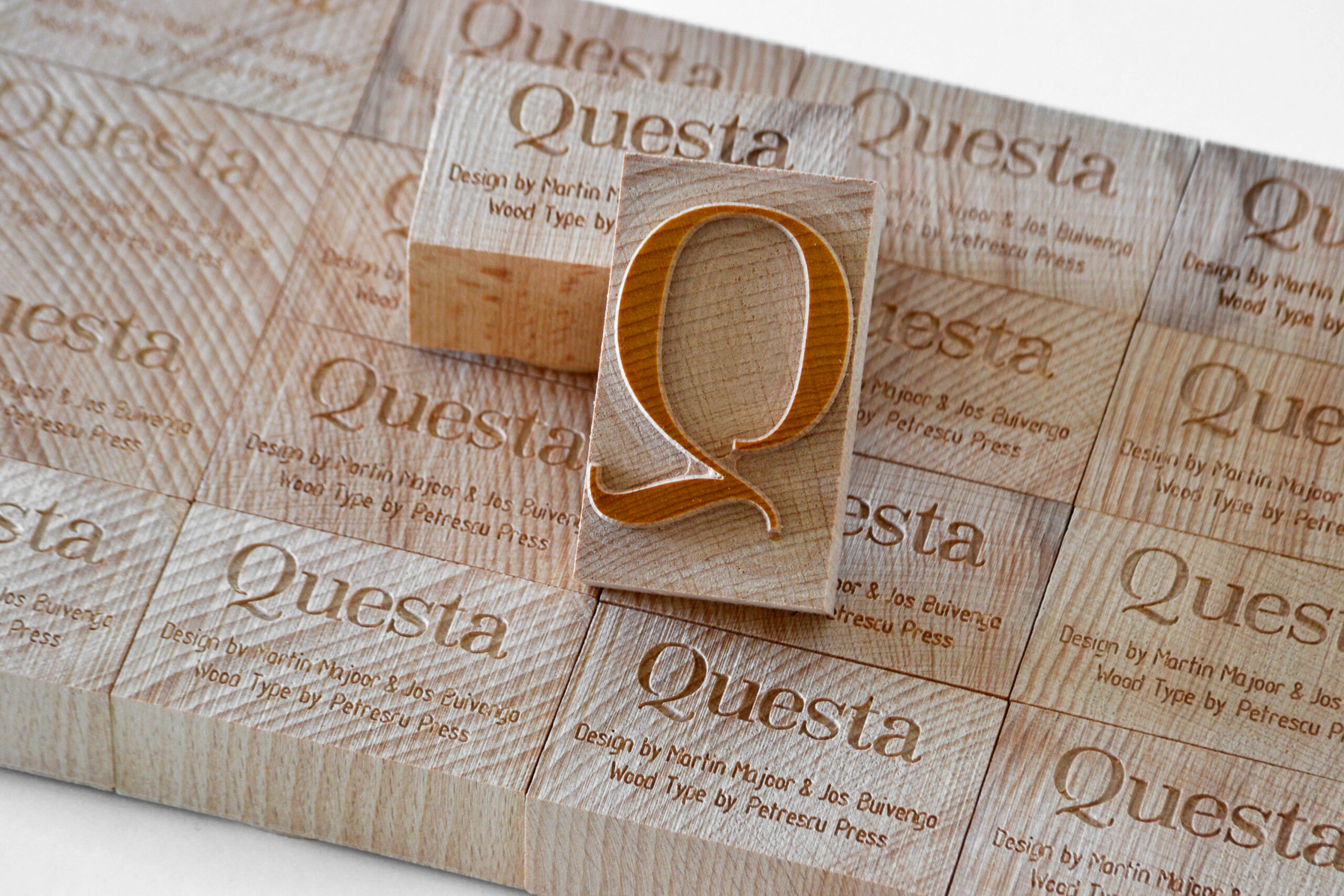
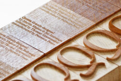
The materials utilized were end grain beech wood, at the 23.56mm European standard thickness, french polished using the traditional method and materials: shellac, alcohol, pumice powder, applied by pad, using olive oil.

The capital “Q” was engraved with the font name, typeface designers, type manufacturer, the patron, set size and content, date.
Wood type specimens were also made for the typeface designers. The letterpress side of the project, and presentation of the typeface and wood type are being done by Mr. Thomas Gravemaker, at Letterpress Amsterdam.

Testimonials
“I had always associated wood type with the old fashioned arts and crafts. But since I know the work at Wood Type Customs I am overwhelmed with the sheer quality of the types they produce. The combination of professionel 3D computer generated drawings and the highly skilled carving techniques makes their wood types outstanding.” January 08, 2020 – Martin Majoor – Type Designer