Charles Rennie Mackintosh Letters


I chose to make this project because Mackintosh’s work is just beautiful in the truth aesthetic meaning. I have to mention that Charles Rennie Mackintosh (born June 7, 1868, Glasgow, died December 10, 1928 London) was one of the most influential designers of Arts & Crafts and Art Nouveau movement in the UK and Europe.
Charles Rennie Mackintosh ornaments were encoded in Celtic symbolism.
The Arts and Crafts movement is about revival the traditional methods using simple, romantic or folk forms. The movement advocated economic and social reforms and was considered to be anti-industrial.
Art Nouveau is easily recognizable due to its curved lines, “flowing” naturally, full of syncopated rhythms.
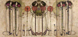
The frequent use of open curved lines such as the parabola or hyperbola.
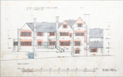
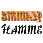
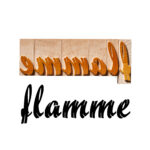
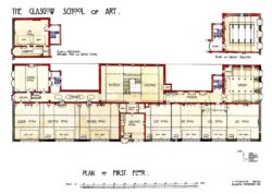
I started by redrawing the letters from his notes and his signature on the original architectural drawings (plans, sections, facades, posters, etc) date between 1900 and 1910.
I supposed that the drawing tool was the ruling pen; which is a drawing instrument used at that time, contains ink in a slot between two flexible metal jaws, which are tapered to a point. The line width can be adjusted by an adjustment screw connecting the jaws. Originally used for technical drawings, in architecture, engineering and cartography.
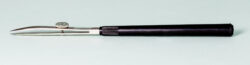
Today is used for calligraphy and it has been replaced with the Rapidograf or Isograph; the Staedtler or Rotring technical pen.
What I noticed in the line of his letters is that he hold the ruling pen perpendicular to the sheet, and does not lift it until finish the letter. Thus, the line of letters took the square shape from the tip of the ruling pen (which leaves a square shape when you mark a dot), this can be seen in all the terminations of each letter and also in the letter “O” below which are two squares left by the ruling pen.
The geometry of his letters I succeeded in framing it in three simple forms: squares, triangles, and circles, except for a few numbers where I drew ellipses. The only challenge was drawing the ampersand, because some drawings are not legible.
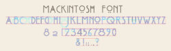
Also the horizontal line, doubled, in the letters “A” and “H”, reminds us of trade mark features in his royal chairs design.

After completing the drawing of the alphabet in a CAD program, the design was converted trough the CAM program and cut into wood type, at standard US type height of 0, 918, ready for printing.
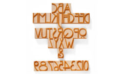
We used traditional methods for materials and techniques for preparing the wood finishing on end grain (powder of pumice stone, oil and shellac – french polish).
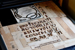
A letterpress poster made on a FTC Italian printing press.
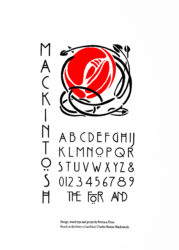
While making the C. Rennie Mackintosh letters, we noticed his particular catchwords, and added some of them to the type set. Also, we tried our hand at designing an “AND” and “THE”.