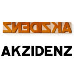
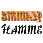
Assab Futurismo Wood Type


This project started with Mrs. Marijane Curry initiative, who discovered it, and wished to have a wood type set with this typeface. She co-opted Mr. Walters, who also became very excited by this endeavor, and the opportunity to print with ”this wild 1920’s typeface”.
He provided us with research and source vector graphics, and he only tells us of himself that : [I’m] ”an old fellow who loves letterpress printing and typefaces, I have no web site, I collect both metal and wood typefaces, and when I have time, sometimes I will print things. I also collect the machines for making metal type and sometimes I make wood type”.
Mr. Gregory Walters shares from his research of the project:
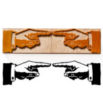
“Sometimes the words would be hand lettered, as for a poster. But the Italian makers of wood type created and cut several Futurismo typefaces. It was much more expensive to make the molds for casting metal type, and the market did not justify the investment. But a wood type maker did not have to invest a lot to make a set of wood patterns. So there were many interesting designs available in wood type that were never offered in metal type. There were perhaps half a dozen makers of wood type in Italy in the 1920’s. Assab was made by Xilografia di Verona, in the city of Verona. The company named their typefaces after places. Assab is named after a city in Eritrea (Africa). Because their unusual faces were not made in metal, they offered wood type in sizes smaller than usually seen. I have collected many fonts of wood type from Italy that are 3-line and 4-line. One does not often find such small wood type from American or English makers. Xilografia di Verona also offered small cabinets to hold these small fonts of wood type. One was called the Radio cabinet because it looked a bit like an Art Deco radio. I have one of these Radio cabinets. It has three drawers and can hold six small fonts. They made another cabinet that was of conventional design and had six drawers, I think. The best holding of Italian metal and wood type is the museum Tipoteca in Italy. They sometimes print posters of fonts”.
Brief history about Assab – a Futurismo Typeface
Futurism is an avant-garde movement founded in Milan in 1909 by the poet Filippo Tommaso Marinetti. Who launched the movement in his Futurist Manifesto, where he expressed a passionate loathing of everything old, and artistic tradition. “We want no part of it, the past”, he wrote, “we the young and strong Futurists!” It glorified modernity and aimed to liberate Italy from the weight of its past.
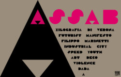
The Futurists admired speed, technology, youth and violence, the car, the airplane and the industrial city, all that represented the technological triumph of humanity over nature. They repudiated the cult of the past and all imitation, praised originality, “however daring, however violent”, “bore proudly”, “the smear of madness”, rebelled against harmony and good taste, swept away all the themes and subjects of all previous art.
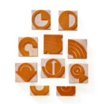
Shape Theory in Assab
If the viewer glances from afar, the graphic details in Assab typeface start fading. We will begin noticing that the shape of the letters, will turn to homogenous blocks, bodies, blunt shapes. We noticed in Assab’s graphic the analogy of a reconstruction game (a puzzle), made from simple geometric shapes – triangles, squares and circles.
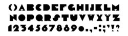
Small shapes bring out the larger shapes, creating a cumulative effect, they construct a directional character, that may suggest movement, growth, as well as depth. The mixture of shapes and intermediary spaces leads to an interwoven composition, thus leaving almost no empty spaces. The only space the viewer is aware of, is the overall surface, a hard and accurate outer shape, specific characteristics to the Futurist movement of that period.
The Assab typeface is meant to be read as a cluster of merged bodies, blunt outlines retain the meaning of letters, even as the viewer steppes back, glances over, or passes by with the speed of a car. It was made of shapes, not lines. It’s content becomes cursive, only to the reader who is willing to be initiated in it’s character, and becomes committed to it’s Futurist nature.
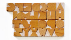
Wood Type Manufacture
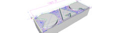
The design section of this project was simplified by Mr. Walters’ input, who has redrawn the entire set of letters, punctuation and numbers. He provided them as .pdf files, that we used to design the program cutting patterns for the required sizes.
For this project, the typeface was cut in four sizes: 4, 5, 6, and 8 line. All sizes were made in a 6A Font Scheme, with a corresponding No.01 scheme each, the process resulting over 750 wood blocks.
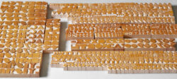
The materials used were end-grain beech wood, at the .918” standard type high. The surface was finished using traditional french polish: shellac varnish, pumice powder and olive oil; resulting in three layers.

Carving of the letters was done using a CNC milling machine. Several other tools were involved in the manufacture process: circular saws, sanders, etc. , used for preparing the wood and cutting the final blocks to size.
Many thanks to: Mrs. Marijane Curry and Mr. Gregory Walters
Petrescu Press, May, 2016
Beautiful! So glad this face was made into wood type.